
Art Deco Travel Posters, Postcards from the Past
How a Generation of Modern Artists Turned the Journey Itself into a Work of Art

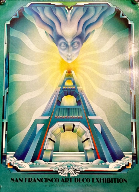
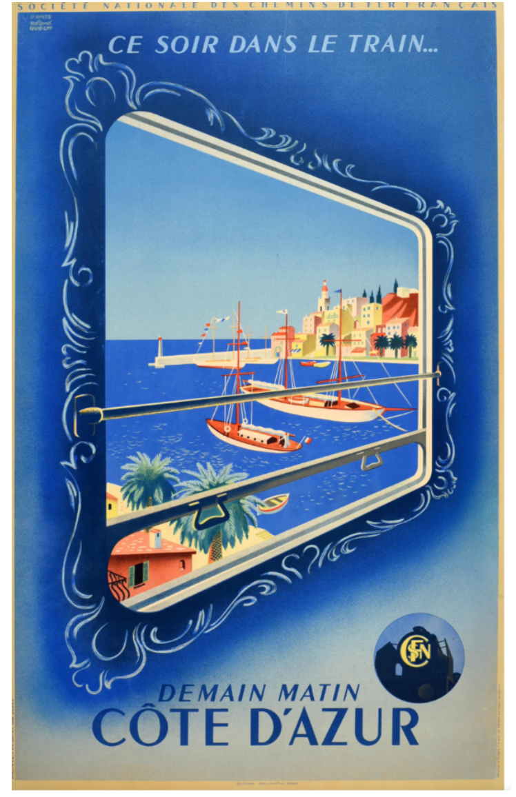
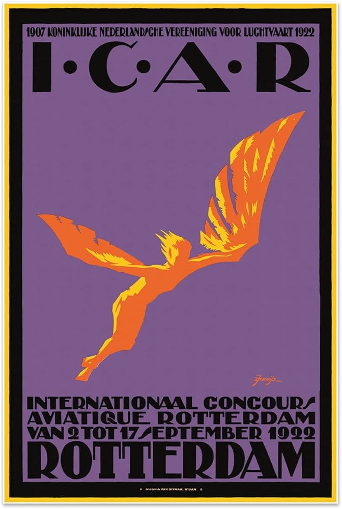
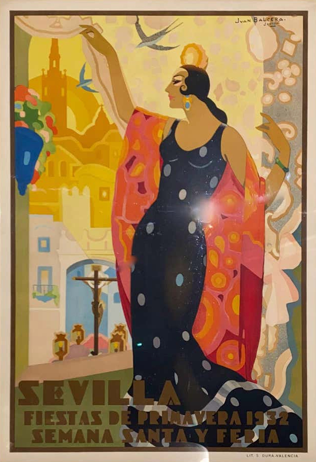
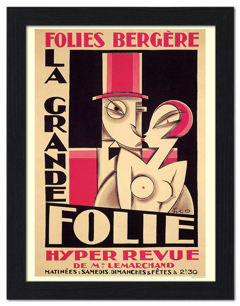
Art Deco travel posters stand among the most vivid and enduring graphic achievements of the modern age. Between the 1920s and the years just before the Second World War, a new generation of artists across Europe was asked to take on an unusual task. They were hired to sell movement itself. Steamship lines, railway companies, airlines, airship operators, resort towns, and national tourism boards all needed images that could catch a passerby in an instant and plant the seed of a journey. What those artists produced went far beyond simple advertising. They created some of the clearest and most confident visual statements of the entire Art Deco period, work that still defines the visual memory of the interwar years nearly a century later. Their posters sold speed and distance and the promise of arrival. They also taught a whole generation how to look at the world.


Left: Lac d’Annecy, Roger Broders, 1930, Middle: Mittelmeerfahrten, Albert Fuss, 1930, Right: Knaresborough, Henry George Gawthorn, 1925
The travel poster came of age because the world itself was speeding up. The decades surrounding the First World War had brought one transportation revolution after another. The steam locomotive reached full maturity and nearly doubled its top speed within a single generation. The automobile went from curiosity to standard middle-class ambition. Ocean liners grew into floating palaces that competed openly for the fastest Atlantic crossing. Airplanes and zeppelins began carrying paying passengers across borders that had once required weeks of travel. Tourism was expanding beyond the aristocratic Grand Tour and beyond the doctor’s prescription of a stay at the spa, and it was reaching a new and eager middle-class audience. Transportation companies needed a way to reach that audience quickly and memorably. The printed poster, pasted on walls and kiosks in every major city of Europe, became their chosen medium.
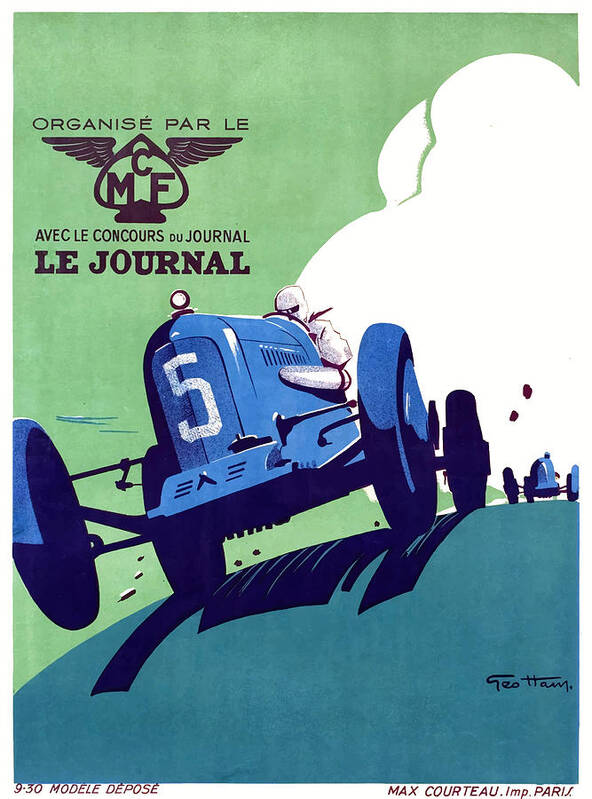
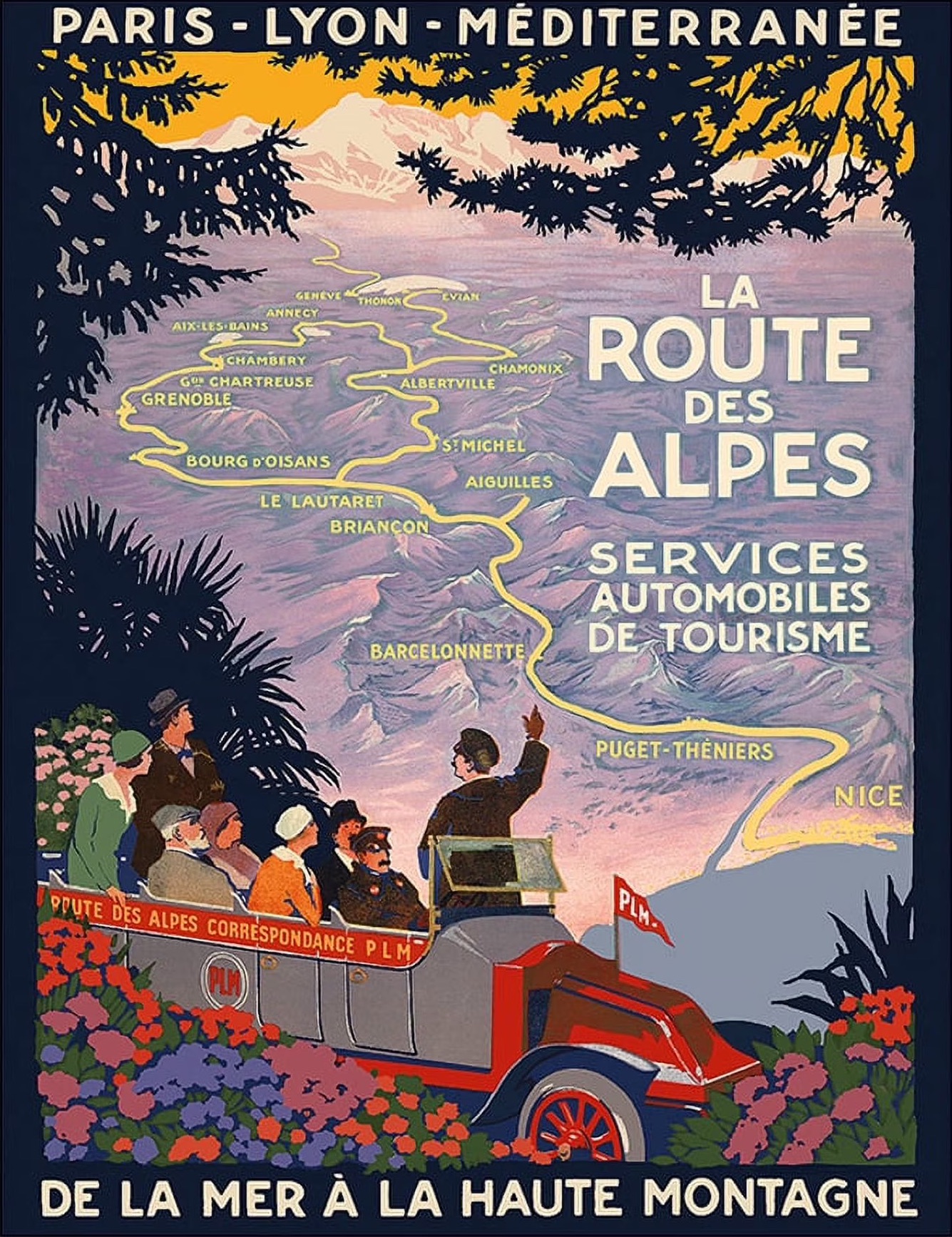
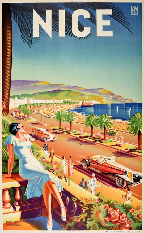
Left: Grand Prix de l’Automobile, Geo Ham, 1930, Middle: La Route des Alpes, Roger Broders, 1920, Right: Nice, Roger d’Hey, 1930
No subject suited the Art Deco poster better than the ocean liner. These ships were cities of steel and velvet that crossed the Atlantic in four or five days, and the companies that owned them wanted images equal to their ambition. A.M. Cassandre became the undisputed master of the form. His 1935 poster for the Normandie became the most iconic travel image of the entire era, reducing the great liner to a towering black prow seen head on, rising above a small flock of gulls with the silent authority of a cathedral. His earlier 1928 image for the Holland America Line’s Statendam deserves almost equal attention. Rather than show passengers in a lounge or a deck at sunset, Cassandre painted the ship’s smokestacks and ventilators as pure machine-age sculpture. He was borrowing, it turned out, from a lost painting called Boatdeck by the American expatriate artist Gerald Murphy, which had caused a stir at the 1924 Salon des Indépendants in Paris. The approach was counterintuitive but brilliant. By reducing the ship to its engineering, Cassandre argued that real comfort came not from ornament but from the silent competence of modern machinery. His work taught the whole industry a lesson it never forgot.

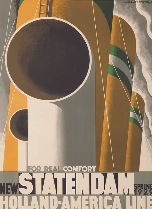
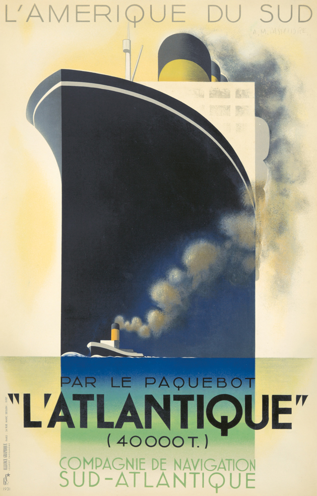
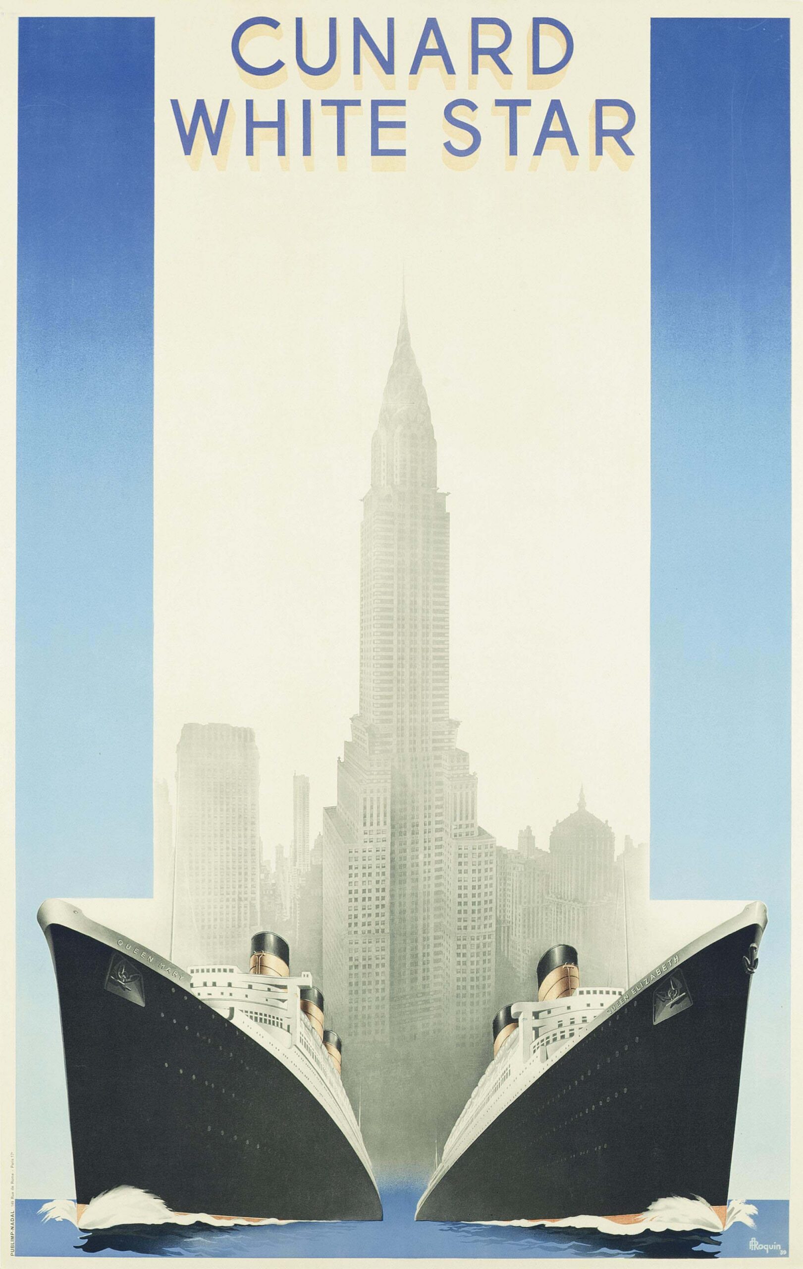

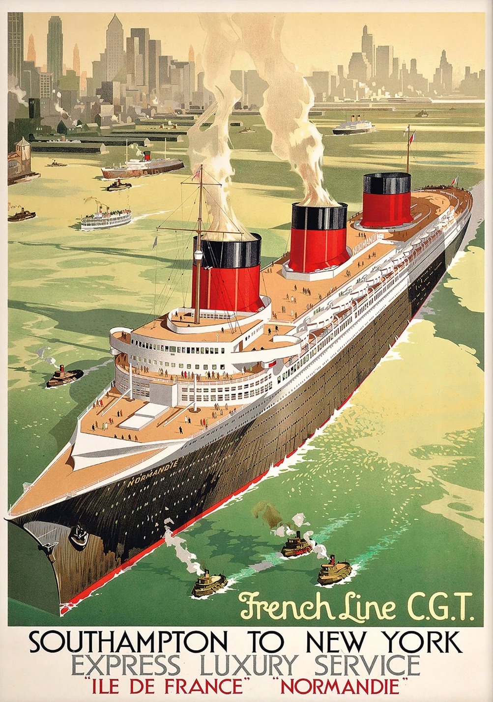
Top: Left: Normandie, A.M. Cassandre, 1935, Middle: Statendam, A.M. Cassandre, 1928, Right: L’Atlantique, A.M. Cassandre, 1931. Bottom: Left: Cunard White Star, A. Roquin, 1939, Middle: Sunshine Cruises, Kenneth Shoesmith, 1920, Right: French Line C.G.T., Albert Sebille, 1935
Railways shaped the golden age of travel posters every bit as deeply as the great steamships. Europe was crisscrossed by lines that carried travelers between capitals, up into the Alpine passes, and down to the Mediterranean coast. Every major rail company commissioned artwork on a serious scale. Cassandre produced defining work for them as well, most notably his Nord Express, in which a rushing locomotive dissolves into forced perspective and flying telegraph wires. In Britain, the London Underground and the great railway companies commissioned artists like Edward McKnight Kauffer to treat the train and the platform as subjects of modern design. Other posters captured something more dreamlike. A 1935 image for the Danish Railway fused a train and a ship into a single mechanical apparatus devoted to collapsing the space between Copenhagen and the rest of the continent. These were not quiet pictures of transportation. They were arguments for it, and they helped fill the carriages of every line that printed them.
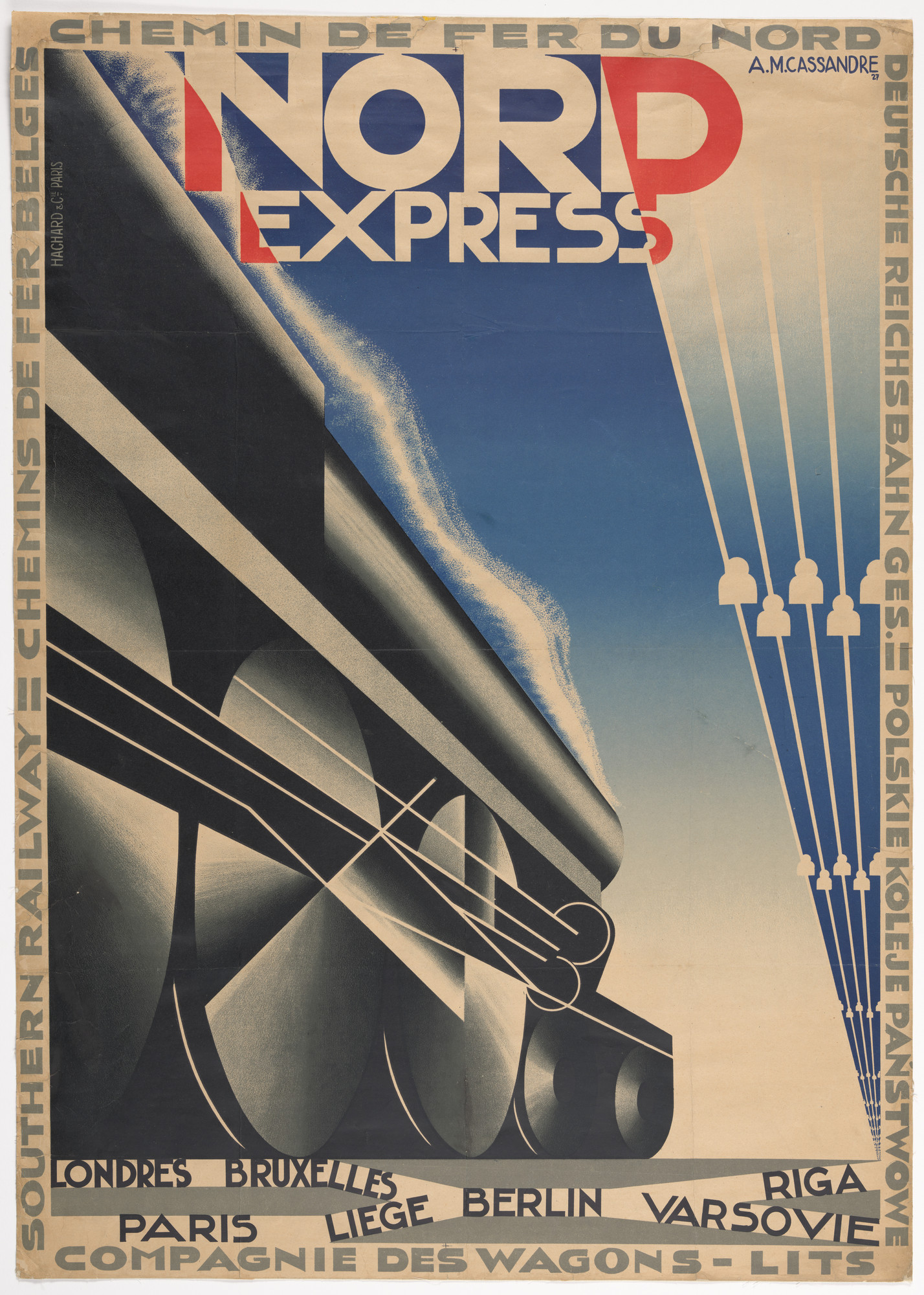
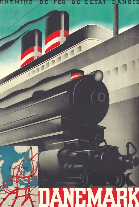

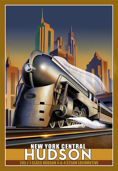

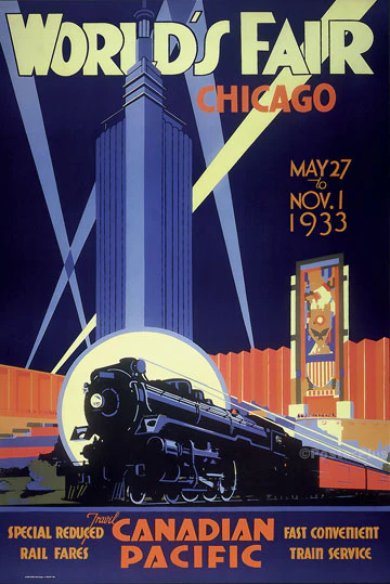
Top: Left: Nord Express, A.M. Cassandre, 1927, Middle: Danemark, A.M. Cassandre, 1934, Right: Étoile du Nord, A.M. Cassandre, 1927. Bottom: Left: New York Central Hudson, Leslie Ragan, 1931, Middle: Côte d’Azur Pullman Express, Pierre Fix-Masseau, 1929, Right: World’s Fair Chicago, Norman Fraser, 1933
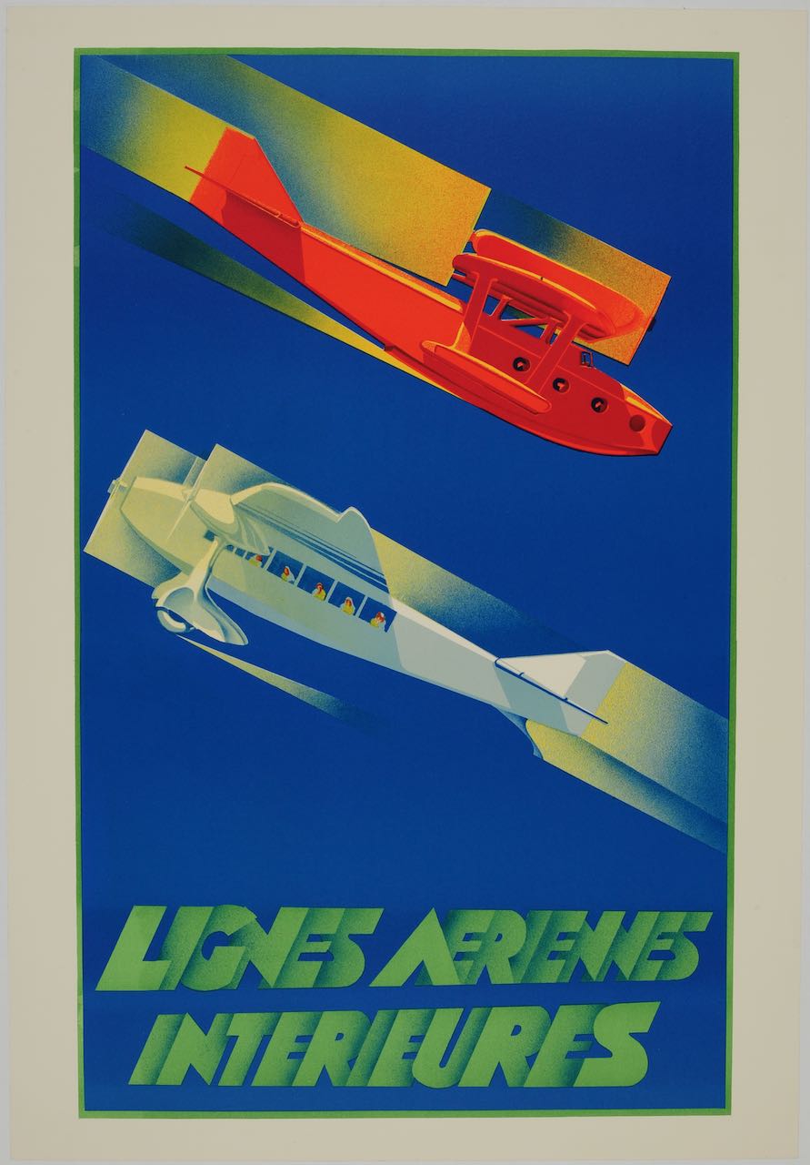
Air travel gave the poster artists an entirely new vocabulary to work with. The sky was open territory. The earliest passenger aircraft and airships carried a sense of possibility that no earlier mode of travel had ever managed. Airlines and airship companies needed images that could make the unfamiliar feel safe and glamorous in equal measure. Ottomar Anton, a German artist working in Hamburg, captured the polished futurism of the Graf Zeppelin around 1932, placing the airship above an ocean crossing that seemed almost ceremonial in its calm. Air France had been formed in 1933 from a merger of several smaller French airlines, and it built one of the most memorable poster programs of the decade. Albert Solon designed its earliest advertisements. Roger de Valerio followed with witty images celebrating the shrinking flight time between Paris and London. Roland Hugon went further still in 1936 with a remarkable photomontage for Air Fer, showing how a single ticket could carry a traveler straight from the rails onto the wings of an airplane. Connected travel had never looked so effortless, and no later era has truly improved on the idea.

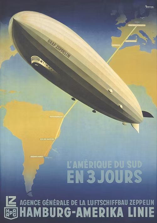
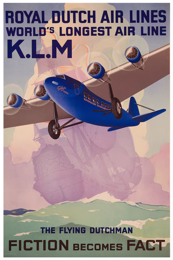
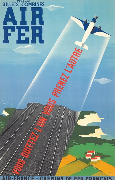
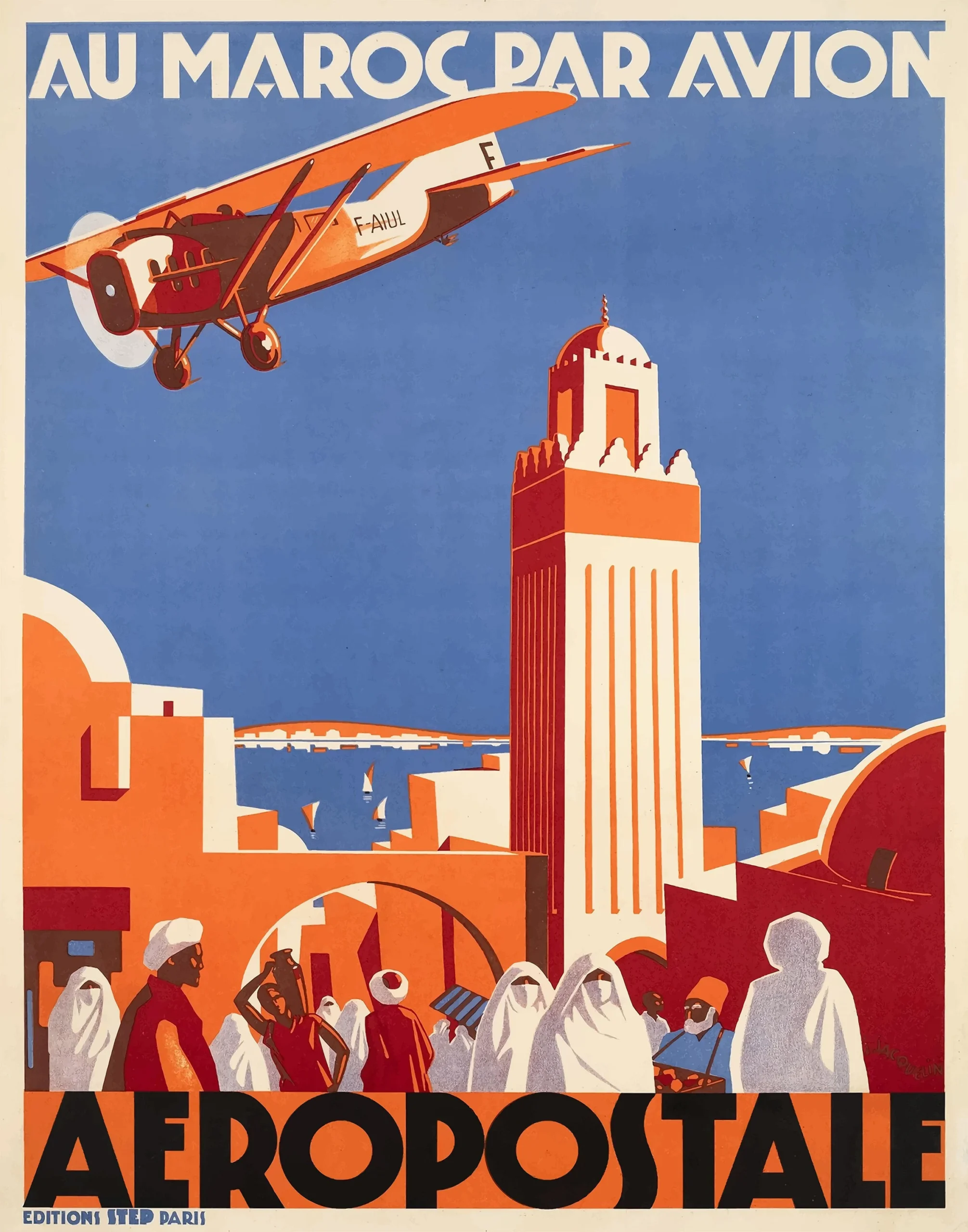
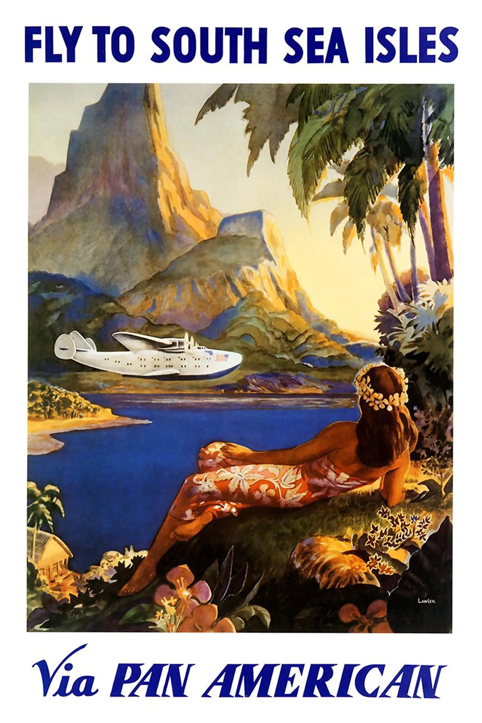
Top: Left: Paris London 75 Minutes, Roger de Valerio, 1938, Middle: L’Amérique du Sud en 3 Jours, Ottomar Anton, 1936, Right: The Flying Dutchman, Jan Wijga, 1934. Bottom: Left: Air Fer, Roland Hugon, 1936, Middle: Au Maroc par Avion, Jean Jacquelin, c. 1930, Right: Fly to South Sea Isles via Pan American, Paul George Lawler, c. 1938
While the transportation companies sold the journey, destination posters sold the dream waiting at the other end of it. Resort towns and regional tourism boards across Europe hired artists to distill their beaches, their mountains, and their historic streets into a few unforgettable colors. The French Riviera led the way and set the visual standard for everyone else. It had been reinvented as a playground of the Lost Generation during the 1920s, and its towns competed fiercely for visitors. Maurice Lauro’s 1927 poster for Trouville paid homage to the new cult of sunbathing, a fashion that had only taken hold in 1923 after Coco Chanel appeared publicly with a tan. Michel Bouchaud gave La Plage de Monte Carlo its most stylized Deco treatment in 1929. Above all of them stood Roger Broders, whose short career as a poster artist between 1922 and 1932 produced some of the most collectible travel images ever made. Broders worked primarily for the Paris-Lyon-Méditerranée railway, and his flat panels of saturated color gave places like Calvi, Vichy, and the Côte d’Azur an almost cinematic allure. He made the act of arriving somewhere feel every bit as stylish as the trip that carried you there.
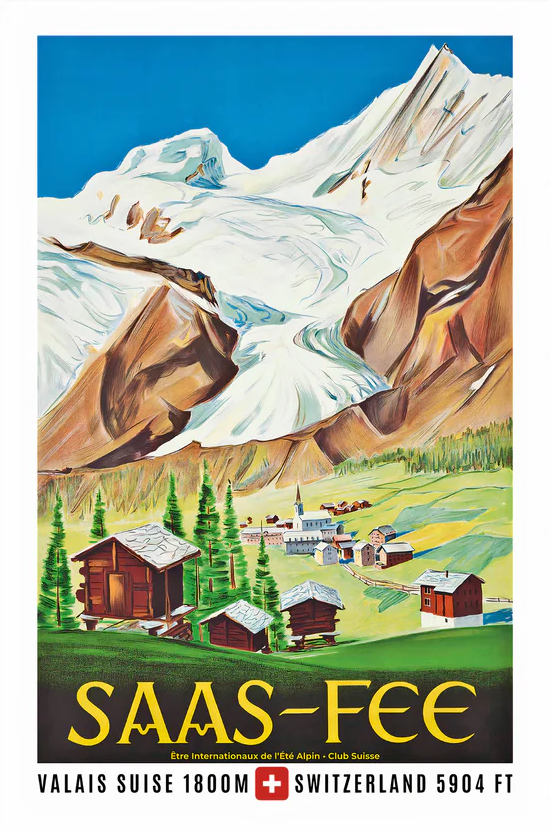
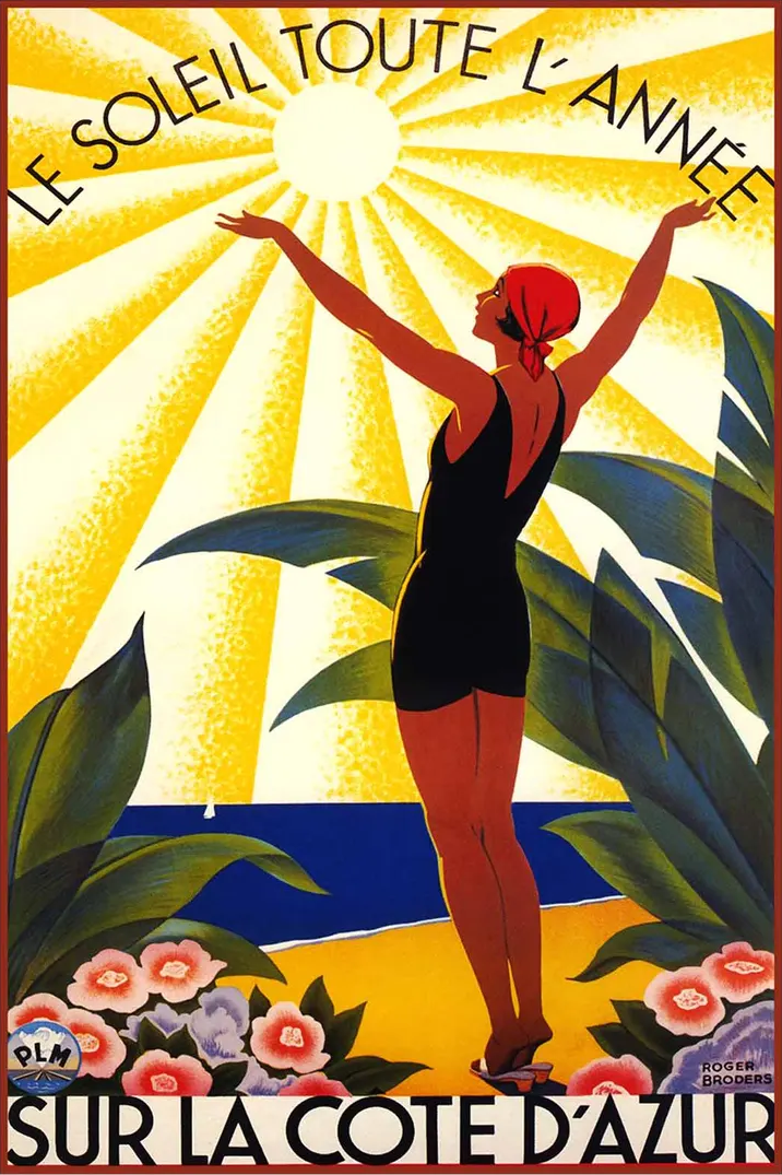
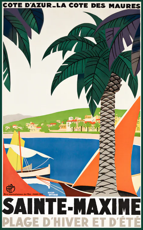
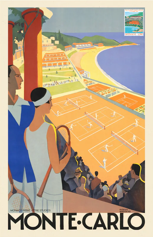


Top: Left: Saas-Fee, artist unknown, 1947, Middle: Le Soleil Toute l’Année sur la Côte d’Azur, Roger Broders, 1930, Right: Sainte-Maxime, Roger Broders, 1932. Bottom: Left: Monte-Carlo, Roger Broders, 1930, Middle: Vichy Comité des Fêtes, Roger Broders, 1928, Right: La Plage de Calvi, Corse, Roger Broders, 1928
The United States developed its own distinct tradition of travel posters during the same period, and it took a very different path from the European one. While French and British designers were selling ocean crossings and Alpine resorts, American artists were increasingly focused on the vast interior of their own country. The railroads led the way in the 1920s and early 1930s. Lines like the Santa Fe, the Great Northern, and the New York Central commissioned bold posters that promoted the Grand Canyon, the Rockies, and the great western landscapes as destinations worthy of any European tour. The real turning point came during the Great Depression. In 1935 the federal government established the Works Progress Administration, and within it the Federal Art Project put thousands of unemployed artists back to work. One of its most enduring legacies was a series of silkscreen posters promoting the national parks. Artists like Chester Don Powell and Dorothy Waugh produced images of Yellowstone, Yosemite, Grand Teton, Zion, and Mount Rainier that remain among the most recognizable American graphic designs of the twentieth century. These posters stripped each park down to its essential shapes and colors, using flat planes and crisp outlines in a style that owed as much to European Art Deco as it did to American modernism. They proved that the visual language of the travel poster belonged to the whole world, not just to the great capitals of Europe.

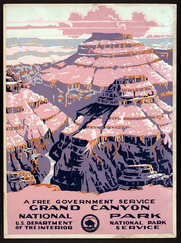

Left: Grand Teton National Park: Ranger Naturalist Service, Chester Don Powell, c. 1938, Middle: Grand Canyon National Park: A Free Government Service, Chester Don Powell, c. 1938, Right: Yellowstone National Park: Ranger Naturalist Service, Old Faithful, Chester Don Powell, c. 1938
Behind every great poster of the period stood the disciplined craft of color lithography. The process had been developed in the late eighteenth century and refined throughout the nineteenth, and Art Deco printers pushed it to a new level of precision. An artist drew each color separately on a limestone slab or a metal plate, and the stones were printed in careful sequence so that every layer fell into perfect registration. The result was a richness of color and a crispness of line no earlier printing method could match. This technical precision suited the Art Deco style beautifully. Flat fields of saturated color and hard-edged geometry demanded exactly that kind of discipline, and the best Parisian printing houses became household names within the trade. The artists themselves were often celebrated figures in their own right. In France, designers like Jean Carlu, Paul Colin, Charles Loupot, and Charles Gesmar produced travel and entertainment posters at an astonishing pace. Ludwig Hohlwein brought his dramatic poster style to German travel subjects before drifting into darker political work later in his career. In Britain, Kauffer anchored a generation of designers who turned the London Underground into one of the great private patrons of modern art. Together, these artists proved that commercial graphics could stand beside architecture, furniture, and fashion as a serious expression of the age.
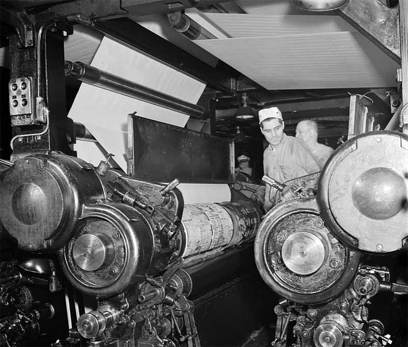

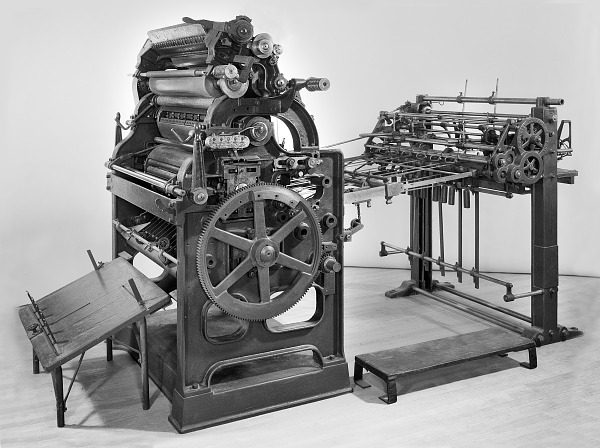
Left: Pressmen operating a high-speed rotary press at The New York Times, 1942, Middle: Labeled diagram of the Ingram Rotary Machine, a Victorian-era press engineered for illustrated newspapers, Right: Harris Automatic rotary press, an early offset lithography machine used for mass-producing posters and commercial print
It is easy to forget that every great poster of the period began as a physical object made by hand in a noisy workshop. The print houses of Paris, London, Berlin, and New York were industrial operations on a serious scale. Their floors were crowded with flatbed presses, rotary cylinders, and the long rows of inked rollers that turned an artist’s drawing into a thousand identical sheets. Pressmen worked long hours pulling proofs and adjusting registration by eye, often correcting tiny shifts in alignment that would have ruined a print if left alone. The flatbed lithographic presses of the late nineteenth and early twentieth centuries gave way to faster rotary machines as the demand for color printing grew. By the 1930s and 1940s, automated offset presses were turning out posters and public information campaigns at speeds the earlier generation could scarcely have imagined. The artists got the credit, and rightly so, but the pressmen and the printers were every bit as essential to the finished result. Their craft is part of what collectors are really paying for today, even if they rarely think of it that way.


Top: Left: Rhein Zauber, Ludwig Hohlwein, 1935, Middle: Bagnoles de l’Orne, Paul Colin, 1937, Right: Fly to South America, Jean Carlu, 1952. Bottom: Left: Exposition Internationale Arts Décoratifs, Charles Loupot, 1925, Middle: Chicago, Leslie Ragan, 1929, Right: Bandol: Le Casino Municipal, André Bermond, 1930
The great travel posters of the Art Deco period have outlived the companies that commissioned them. The ocean liners are gone. The zeppelins ended in disaster. Many of the grand rail routes were swept away by the Second World War and the economic reshuffling that followed it. Yet the posters themselves remain, and they are arguably more admired now than they were at the time of their printing. Collectors prize them for their bold design, their historic subjects, and the craftsmanship of their lithography. The best examples by Cassandre and Broders command serious attention at auction, and rarer regional images often hold their own in the same rooms. Their appeal reaches across every boundary of collecting. They belong at once to graphic design, to the history of travel, to architecture, and to the broader culture of the interwar years. More than anything, they preserve a particular and irreplaceable kind of optimism. They remind us that travel was once framed as entry into a refined and modern life, and that a single image on a wall could be enough to set a stranger dreaming of a ship, a train, or a distant coast. That is the quiet power of the Art Deco travel poster. It has not faded, and it will not soon.
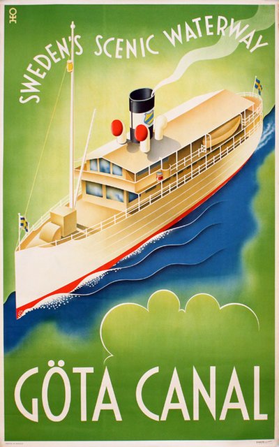
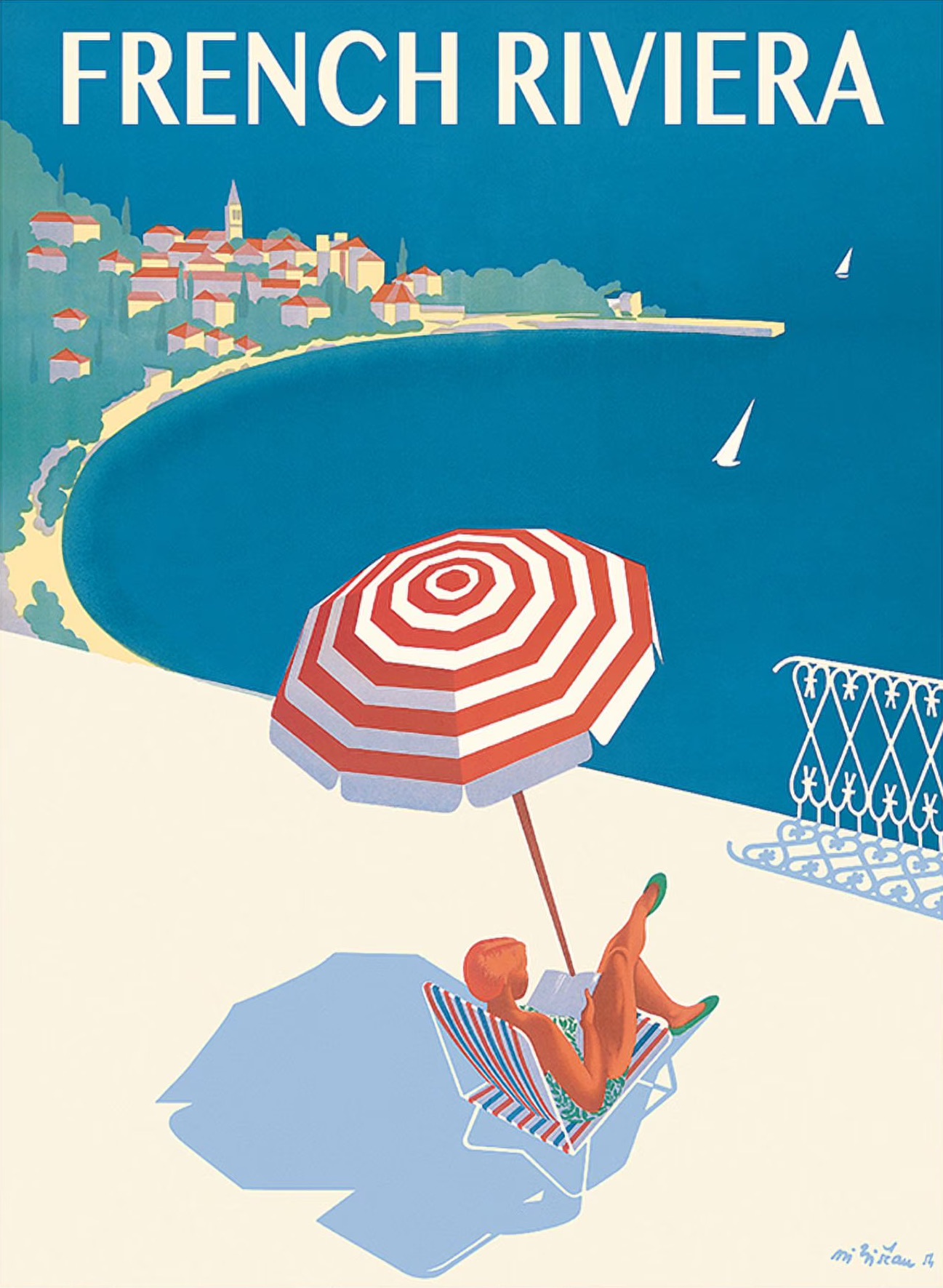

Left: Göta Canal, Hans Erik Olsén, 1936, Middle: French Riviera, M. Bistau, 1951, Right: Furka-Oberalp, Otto Ernst, 1930

If you are interested in further stories of Art Deco design, collecting, and celebrating the artistry of early 20th Century:

Related Products from ArtDecoCollection.com