

Sign Up for Exclusive Offers, Sales & Events
Search Our Site

Journal & Collections

Stamped with Style: Art Deco Post Offices, Mailboxes & New Deal Murals

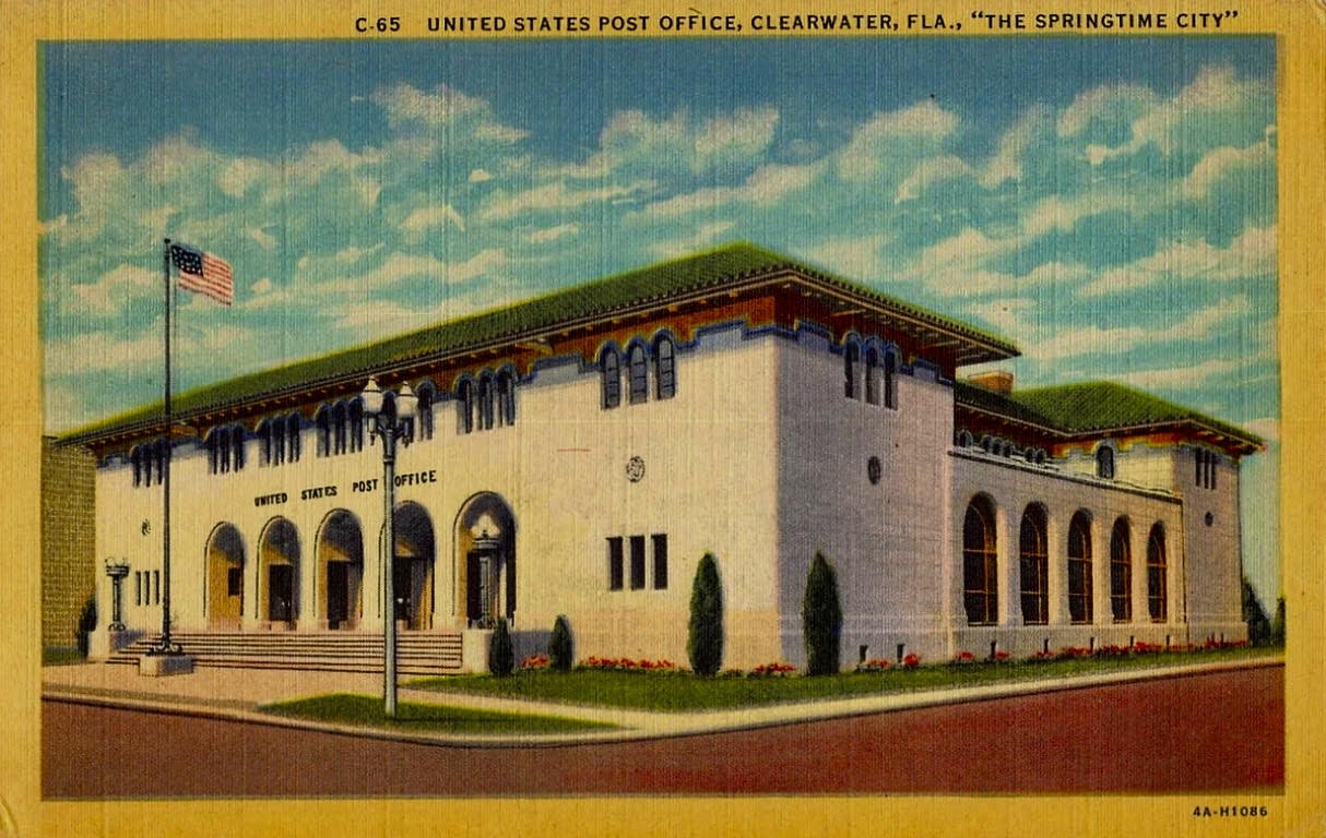
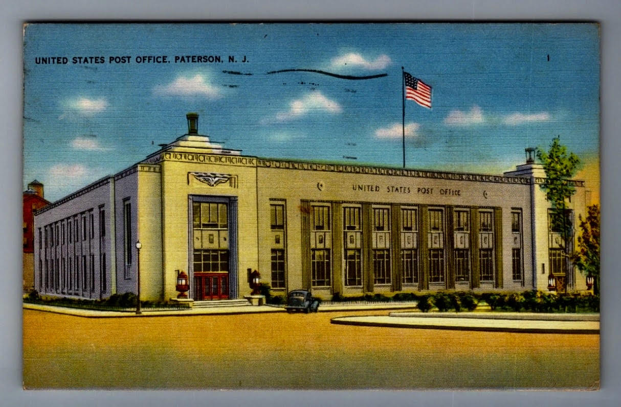
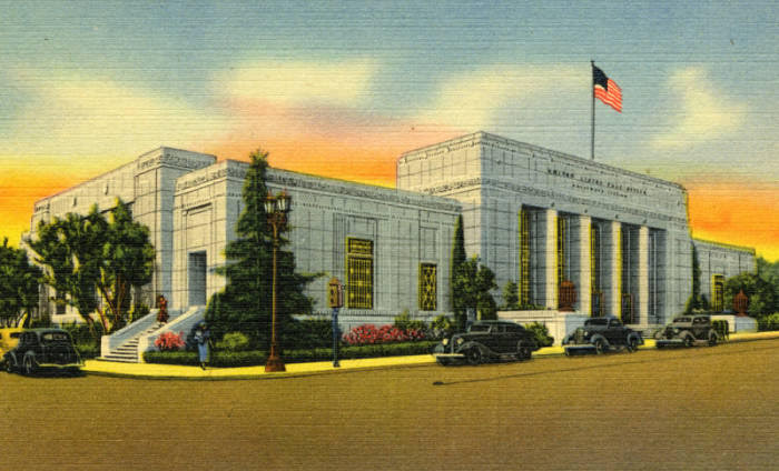
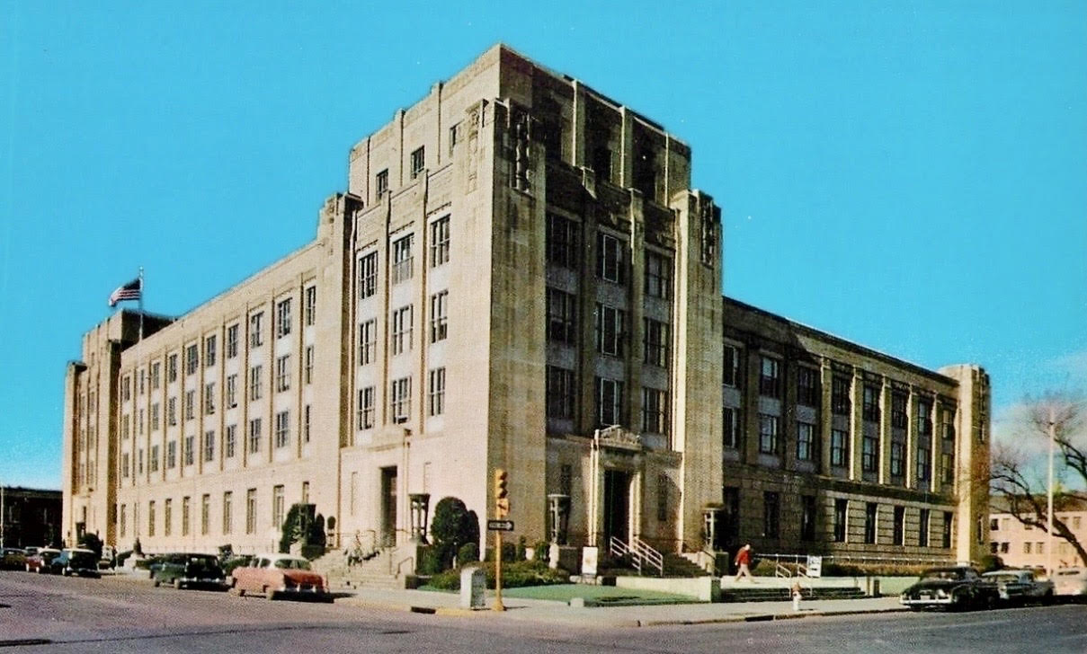
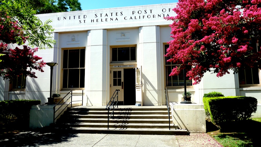
The next time you stop into a post office, give yourself a minute to notice what the building is saying before you rush back outside. In the early twentieth century, post offices were some of the most visible civic interiors Americans visited regularly, and their design had to earn trust through repetition, clarity, and a sense of permanence. Art Deco arrived at exactly the right moment, when speed, modern systems, and public confidence were becoming part of daily life, and the postal service was one of the clearest places where progress could be made visible. You see it in streamlined forms, strong geometry, bold lettering, and metalwork that feels engineered rather than decorative, all cues that the system is organized and meant to work. Step inside, and the same logic continues in readable layouts, durable materials, and interiors designed to move crowds without confusion, which is why these buildings can feel so modern even now. Postcards understood the power of that image too, capturing post offices as civic landmarks and sending the idea of modern public life outward through the mail itself.

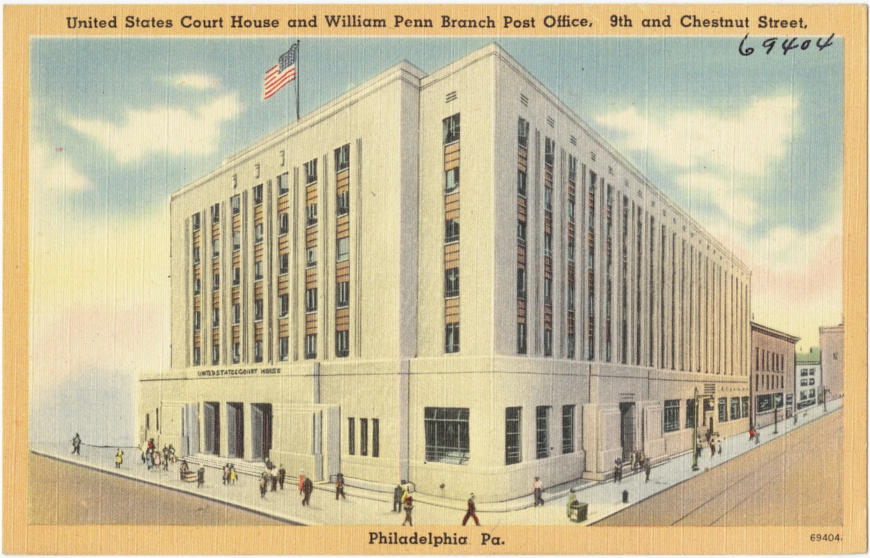
Left: United States Courthouse and William Penn Branch Post Office, Philadelphia, a postcard view of civic monumentality paired with everyday postal service at 9th and Chestnut. Right: U.S. Post Office Terminal Annex, Los Angeles, shown in postcard form as a streamlined hub built for modern volume and movement.

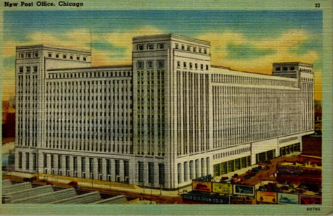
Art Deco post offices are especially revealing because they sit at the crossroads of architecture, graphic design, and everyday routine. On the outside, many were designed to read as civic landmarks, buildings meant to look official and approachable at the same time. The Deco influence often appears as simplified massing, crisp symmetry, and ornament that feels integrated rather than applied, with stylized eagles, chevrons, sunbursts, stepped forms, and sleek metal detailing around entrances. In the 1930s and early 1940s, federal planning also encouraged consistency, so you see a family resemblance across states even while individual cities shaped the final look through local materials and regional expectations. That is exactly why postcards loved them, because the buildings were photographed cleanly, and they represented a city’s modern identity at a glance. A post office could be both a practical workplace and a public symbol, which is a very Deco idea in itself. When you line up postcards from different places, you are essentially watching the United States advertise modern service and civic pride through architecture.

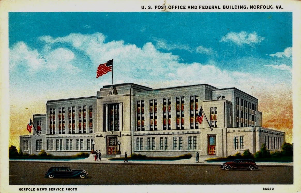
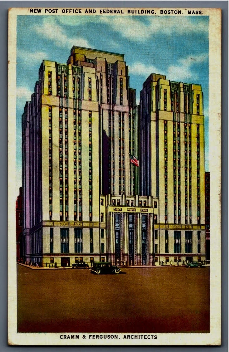
Left: U.S. Post Office and Federal Building, Norfolk, Virginia, promoted as a proud civic landmark in postcard form. Middle: Boston’s New Post Office and Federal Building, by Cram and Ferguson, presented as modern public architecture with a strong downtown presence. Right: New U.S. Post Office, Oak Park, Illinois, a postcard view that frames the building as a crisp, contemporary civic centerpiece.

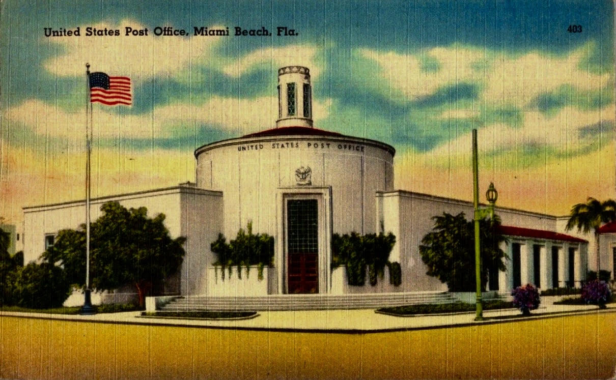
Regional character still matters, and it is one of the most interesting parts of the story once you start comparing examples. Some post offices lean into vertical, monumental presence, the kind of building that anchors a downtown and quietly announces federal permanence. Others move toward Streamline Moderne, emphasizing horizontal motion, smooth surfaces, and a sense of speed that feels related to trains, ships, and industrial infrastructure. In places with strong local architectural traditions, the result can be a hybrid, where regional cues remain, but the details go modern, simplified reliefs, graphic signage, and metalwork that feels current for its moment. This is also where your postcard set becomes more than decoration, because it shows how the same modern vocabulary changes its accent from city to city. Miami Beach makes an excellent lead image because the city’s broader modernity turns a post office postcard into part of a larger design ecosystem, not an isolated building. When you add cards from places like Reno, Hollywood, Los Angeles, and other cities in your archive, the national reach of this civic style becomes impossible to miss.

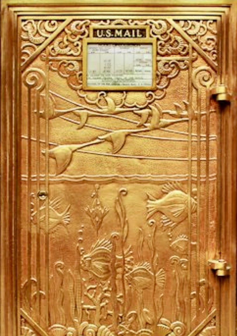
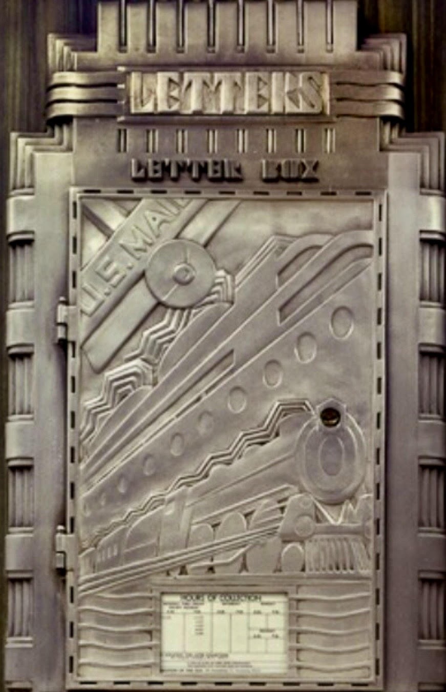
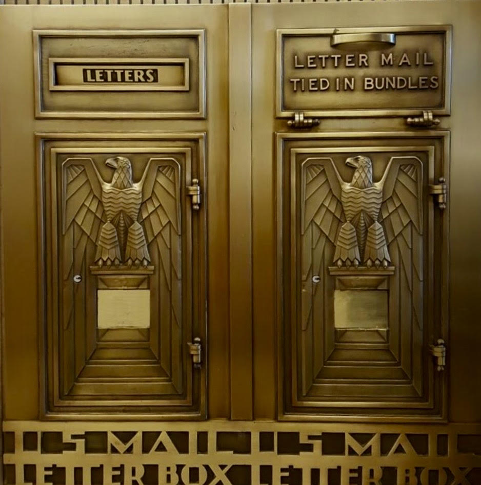
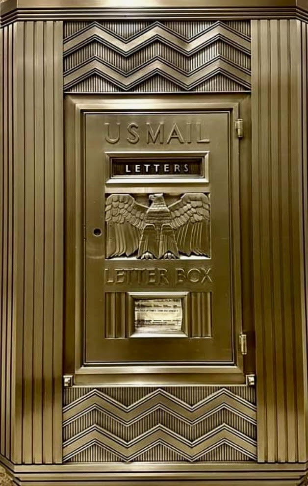
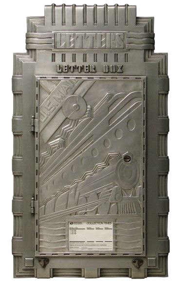
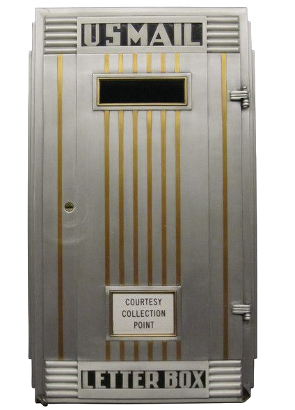
Three letter boxes that show Art Deco at hand level, bold lettering, clean geometry, and durable metalwork that made the everyday act of mailing feel precise and designed.

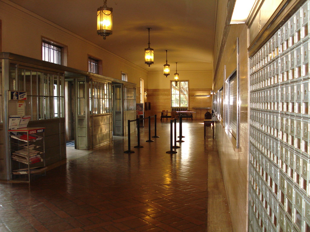
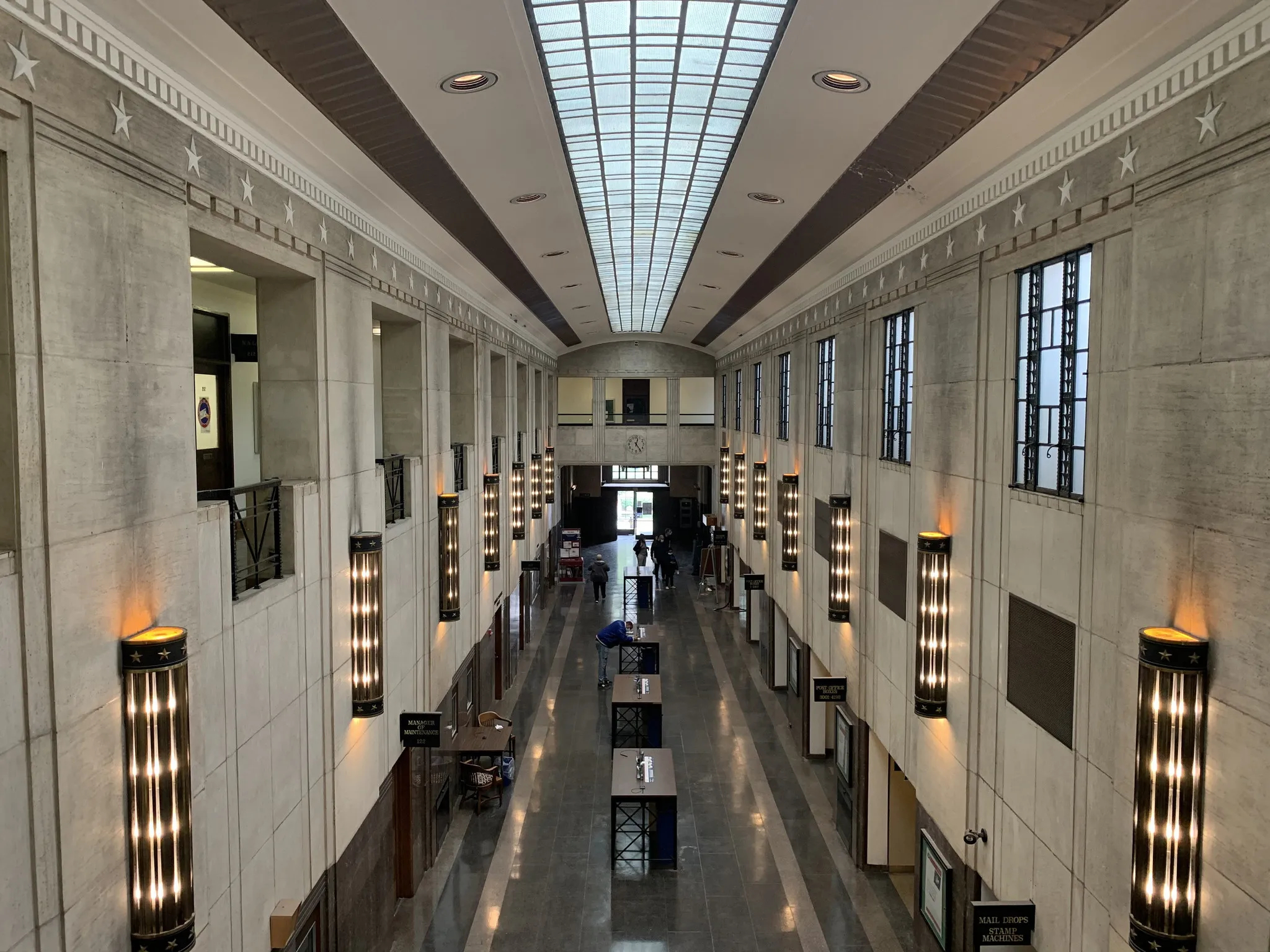
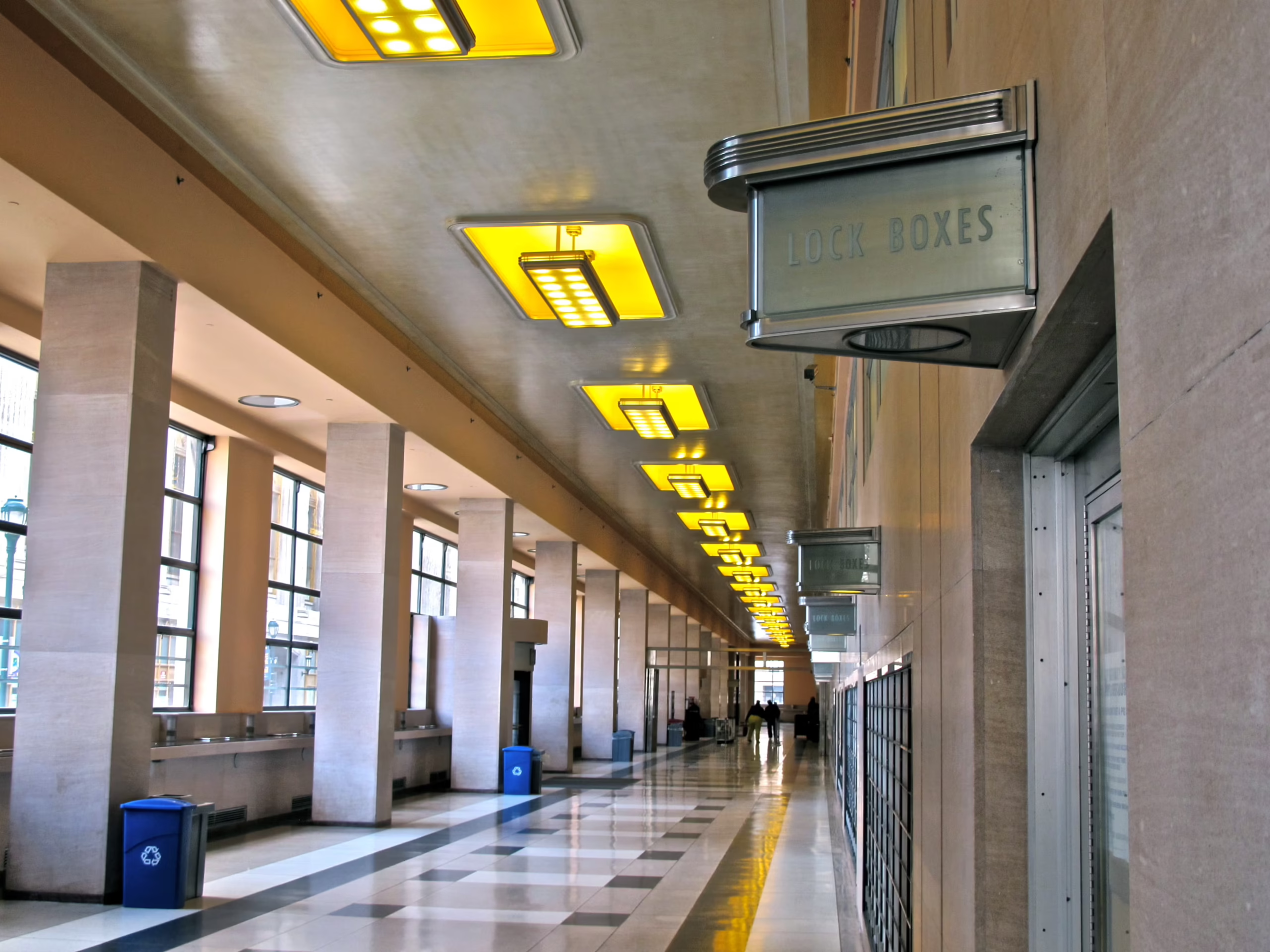
Interiors are where the postal story becomes most convincing, because this is where design had to perform under real use. Postal lobbies were planned to handle crowds, lines, repeated transactions, and a constant flow of people who did not need a lesson in how the room worked. Symmetry here is not only aesthetic, it is functional, helping visitors understand where to go and how the process moves. Durable finishes like stone, terrazzo, tile, and metal were practical choices, but they also reinforced the sense of permanence and public reliability. Typography becomes part of the architecture, with clear labels, consistent numbering, and directional cues that make the experience feel organized even on a busy day. When you find a strong period lobby, you can see why people call these spaces everyday modernism, because modern design is expressed through routine rather than spectacle. The best interiors feel like public rooms designed with dignity, even when you are only there to buy a stamp.

Top left: Oak Park Post Office interior. Top right: Rincon interior letter drop signage. Bottom left: William Penn Annex Post Office lobby. Bottom right: Nashville Main Post Office ceiling, window, and fixtures.

Mail hardware takes those same principles and brings them down to hand level, which is why mailbox photos tend to be so visually satisfying. A letter slot or collection box compresses Deco logic into an object you can touch, with crisp edges, confident metalwork, and lettering designed for instant comprehension. Older mail features also carry a small sense of ritual, because mailing once involved physical steps, a sound, and a moment of finality that is easy to forget now. P.O. box sections expand the same idea into a grid, repeated doors, bold numerals, and consistent proportions that read like architecture in miniature. When several mailbox photos look similar, the differences that matter are exactly the ones Deco cared about most: typeface, spacing, geometry, and the way light plays across polished surfaces. These pieces were built for constant use, which is why the best examples still feel precise, purposeful, and surprisingly elegant. They turn a simple action into something that feels engineered and public.

Left: 29 Broadway, New York, a silvery mailbox reflecting an Art Deco lobby of marble and metallic ceiling detail. Middle: New York County Courthouse, 60 Centre Street, a stern stone letter box that matches the building’s judicial gravitas. Right: Empire State Building letter box, with linear Deco styling and typography that echoes the landmark’s signature look.

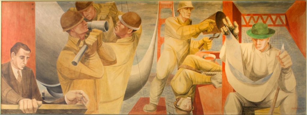
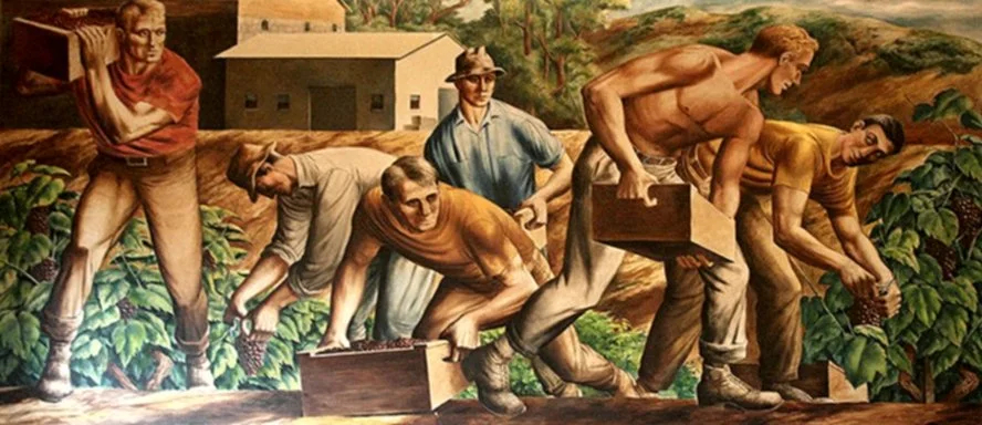
Murals and relief panels add another layer, and they are one of the strongest reasons post offices remain such rewarding places to look. During the New Deal era, federal art programs placed painting and sculpture in public buildings, and post offices became one of the most widespread settings where Americans encountered significant artwork as part of ordinary life. Many people casually call all of this WPA art, but a large share of post office murals were commissioned through Treasury Department programs that used competitions and juries to emphasize quality and broad public impact. The subjects were often chosen to be legible to the community, local industries, landscapes, and episodes of regional history presented as part of a shared civic story. That makes a post office mural both decorative and documentary, because it captures what a town or city wanted to recognize about itself during years of hardship and rebuilding. When you compare examples from different states, you realize how large the tradition is and how much visual history is hiding in plain sight behind routine errands. The post office becomes a quiet gallery, and the waiting line becomes an audience.
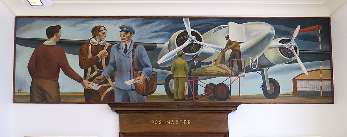
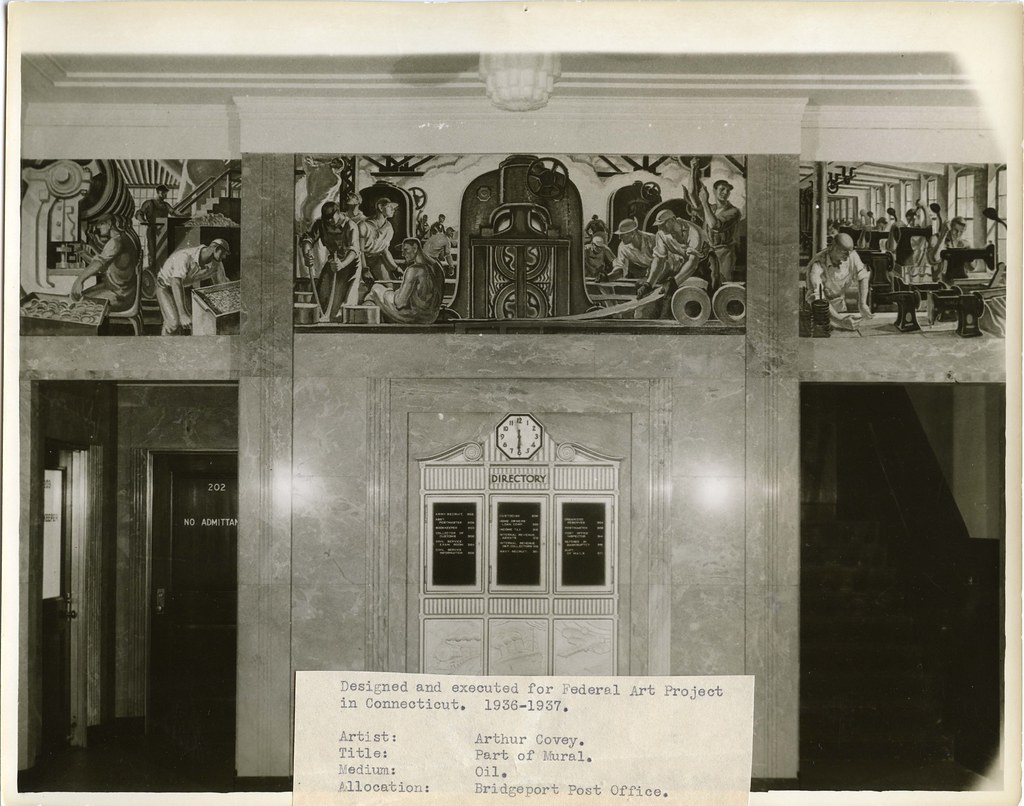
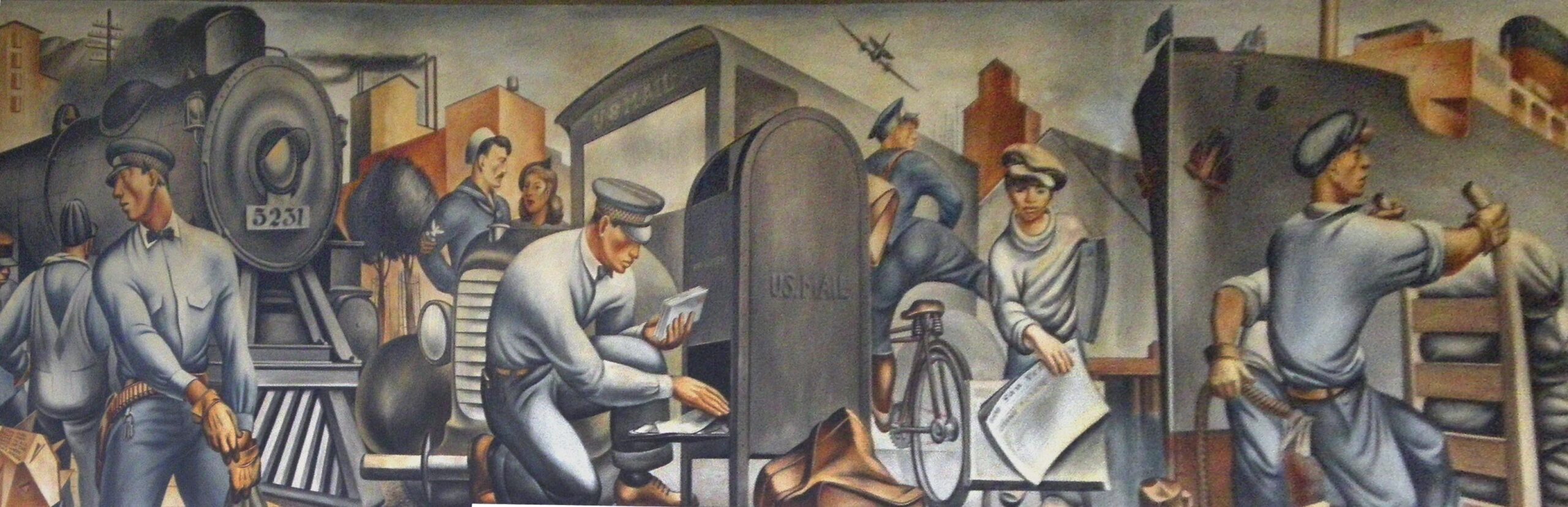
Top left: Air Mail, Daniel Rhodes, 1941, a New Deal era post office mural in Piggott, Arkansas, celebrating modern delivery and national connection. Top right: Installing Bridgeport Manufacturing, Arthur Covey, Bridgeport, Connecticut, a Treasury Section commissioned mural depicting the city’s industrial strength. Bottom: Mail Transportation, Fletcher Martin, 1938, San Pedro, California, linking workers and rail, ship, and air routes into one civic story of movement.

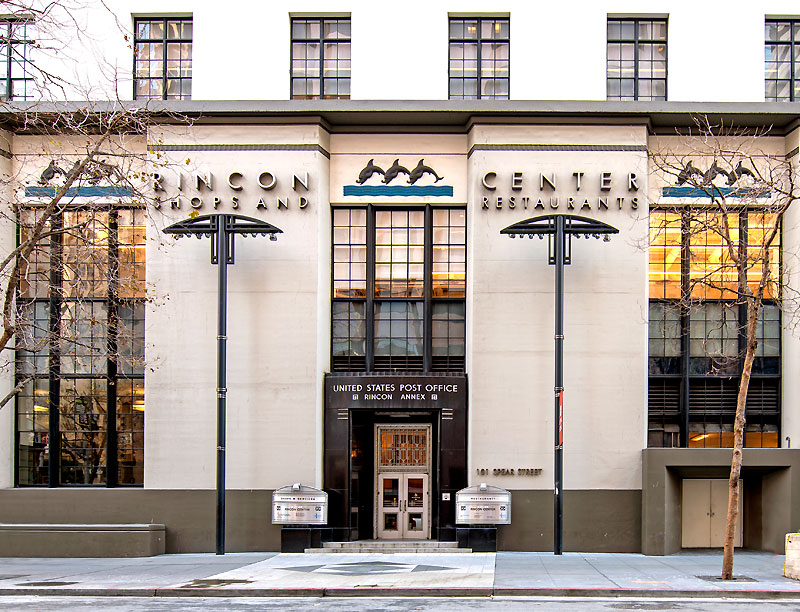
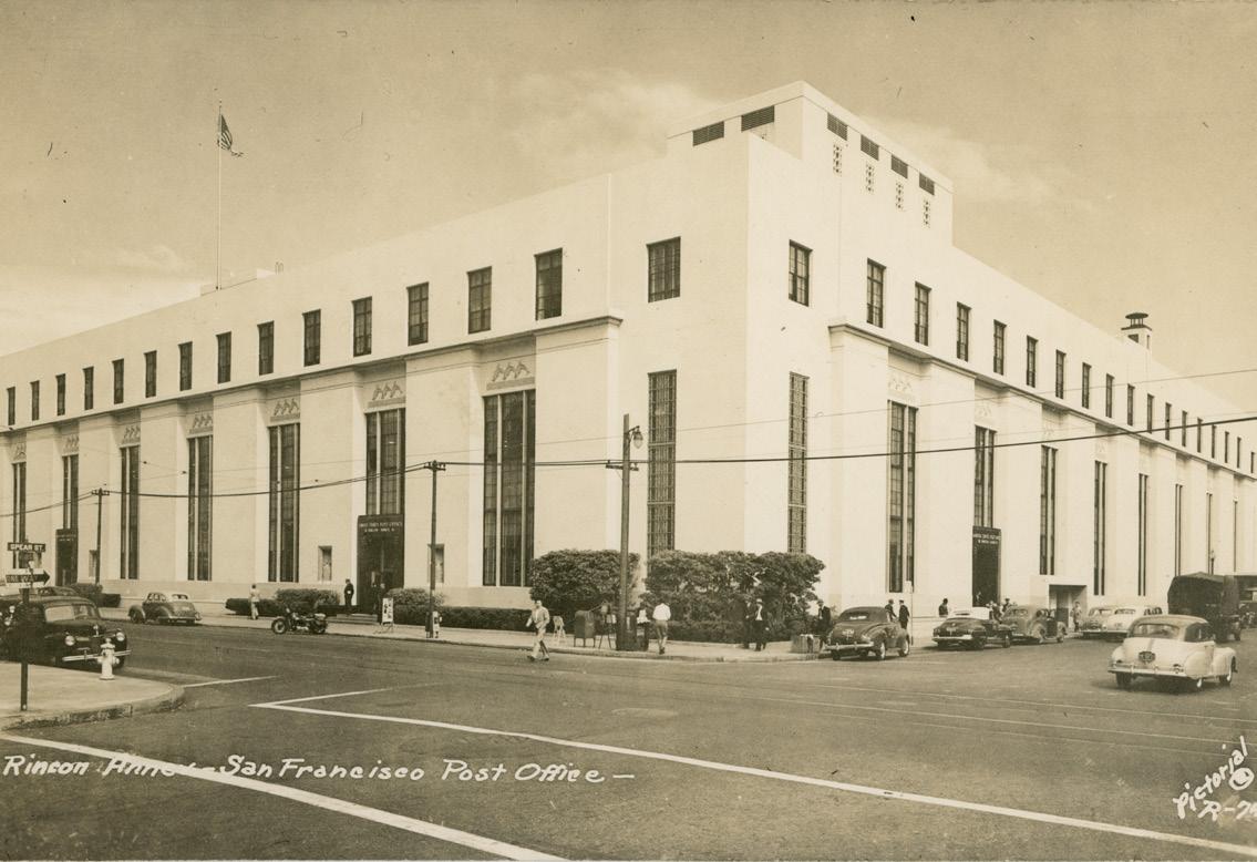
In the Bay Area, the postal story feels especially vivid because the region’s identity has long been shaped by movement and exchange. San Francisco grew as a waterfront city built on shipping, rail connections, bridges, and constant circulation, the kind of place where communication systems were never abstract. That context makes postal architecture feel especially at home here, because the postal system is the everyday version of the same network logic that shaped ports, rail lines, and commercial corridors. Rincon Annex sits at the center of this local chapter, built as a major mail handling facility and designed to look unmistakably modern in both form and detail. Its Streamline Moderne character is clear in the crisp entrances and the way ornament is integrated into structure, including the dolphin reliefs that give the exterior a maritime personality without breaking the streamlined language of the period. Inside, the building’s famous mural cycle turns a former postal lobby into a civic room where history, labor, and public memory are literally on the walls. Seen in that light, Rincon is more than a standout example; it is a clear reminder of how Art Deco could make public service feel modern, legible, and culturally significant.

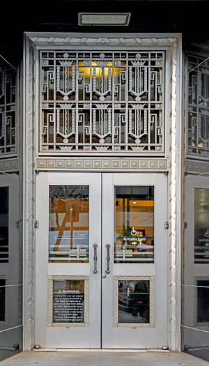
Left: Rincon Annex exterior, San Francisco, with dolphin reliefs that give Streamline Moderne a distinctly maritime accent. Middle: Close view of Rincon’s Art Deco door detailing, where metalwork and geometry carry the design at eye level. Right: Historic photo of the Rincon Annex when it operated as a working postal facility and major mail hub.

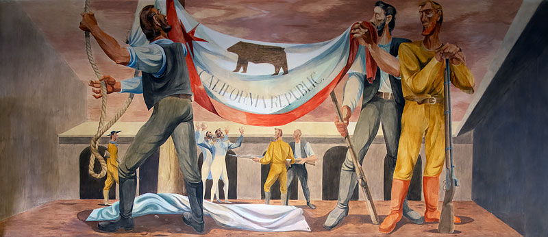
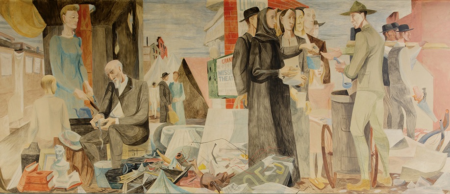
Rincon also becomes the perfect bridge between architecture and mural history because its lobby holds one of the most ambitious post office mural cycles in the country. Artist Anton Refregier created twenty-seven panels depicting episodes from San Francisco and California history, and the project stretched from the early 1940s into the postwar years. Work began in 1941, paused during World War II, resumed after the war, and was completed in 1948, so the murals were born in a period when public narratives and political sensitivities were changing quickly. Refregier’s social realist approach did not sanitize difficult subjects, and that choice drew criticism even before the murals were finished. After completion, the controversy intensified, culminating in a 1953 congressional hearing over whether the murals should be removed, a striking reminder that public art in a public building can become a public argument. The work survived, and the lobby remains accessible today, which keeps the murals in their original civic context rather than isolating them as museum pieces. That is part of what makes Rincon feel alive, because you can still walk in and encounter public history at full scale in a space built for everyday use.

Top: Raising the Bear Flag, a panel from Anton Refregier’s Rincon series, depicting the 1846 Bear Flag moment in social realist style. Bottom: A Refregier panel from the same Rincon cycle showing relief work and rebuilding, with soup service and workshop activity set against a recognizable San Francisco streetscape.

Post offices are easy to overlook because they were designed for routine, but that is exactly what makes their Art Deco character so compelling. These buildings translated big ideas about modern life into everyday experience, clear layouts, durable materials, bold signage, and hardware built to be touched and used without hesitation. The murals push that story even further, turning a practical lobby into a civic room where local history, labor, and identity were placed in public view. In spaces like Rincon, the artwork reminds us that the postal system was not only about moving mail, it was also about shaping a shared sense of place in the middle of daily life. Today, when communication is often weightless and instantaneous, these rooms still feel grounded and human. They show how design once made public service visible, trustworthy, and worth looking at.

Click any photo below to open a gallery with more images

Related Article

Read Heather Christine Ripley’s guide to New Deal era post office murals, featuring Rincon’s Refregier cycle along with standout mural sites and public art details across California and beyond.

If you are interested in further stories of Art Deco design, collecting, and celebrating the artistry of early 20th Century:

Golden Art Deco geometric emblem with the text 'Art Deco Collection' on a black background

© Copyright Art Deco Collection. 2026 All rights reserved. Site Map